
Bringing Assessments Into the Arena
The assessment lane started to take shape with a battle-style workspace, library-backed questions, AI modes, and recruiter review surfaces.
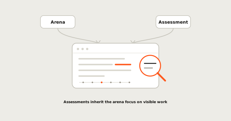
Assessments became a real product lane when the workflow started to feel less like a form and more like a workspace.
What changed
We brought assessment work into a richer IDE-style surface with library-backed questions, code and whiteboard-style prompts, assistance controls, and early recruiter review views. The aim was to make the candidate experience feel closer to actual engineering work while keeping the evaluator's job clear.
The early surface also made room for multiple kinds of tasks. Some roles need algorithmic precision. Others need explanation, debugging, or system thinking. A single textarea cannot represent that well.
Why it matters
Hiring teams often want stronger signal, but the candidate experience gets worse as the tooling gets stricter. That tradeoff is not inevitable. A better assessment can be more humane and more informative at the same time.
Those usually trade off because teams reach for control: lock the browser, ban the tools, narrow the task until it is easy to police. But control is not the same as signal. A focused, workspace-style environment that mirrors real engineering gives you more of both at once. The candidate is calmer because the setting is familiar, and you learn more because you can see how they actually work, not just whether one answer compiled. The stricter, more hostile setup often buys neither.
The product should make expectations explicit, let candidates work in a focused environment, and then turn the result into a reviewable artifact. That is the foundation of Assessments: not just grading answers, but helping teams understand work.
Where it points
From here, the assessment lane needs better evidence lineage, clearer AI fluency scoring, and stronger connections to benchmarked tasks. The bigger goal is simple: help teams hire for how engineers actually work now.
How to read this update
The important question is not only what shipped. It is what new evidence the product can now preserve. For assessments work, a useful release should make the next session easier to understand: what happened, why it mattered, and what someone can do with the result afterward.
That is the bar we use for field notes. A feature is stronger when it turns a hidden process into something reviewable: a timeline, a report, a map, a score explanation, a replay, or a teacher-facing control. The surface can stay simple, but the evidence behind it should get harder to hand-wave.
What to watch next
The next pass should keep tightening the connection between the public story and the product artifact. If a learner reads a note about practice, they should be able to find the loop in the product. If a teacher reads about classroom control, the setting should be visible. If a hiring team reads about assessment evidence, the report should show the trail.
That is a lesson worth borrowing from the strongest developer tools without copying their design: the best content feels like product memory. It does not decorate the roadmap. It makes the product easier to trust.